Design Development
Creating design ideas and prototypes
Phase Overview
In this phase, our team explored several possibilities for how the design for BOW Project Marketplace would look, selected a design by connecting it to our needs analysis and prior user research, and created a low fidelity prototype in Figma. The Design Development phase report covers who we are designing for, the problem we are trying to solve, an overview of our low-fidelity Figma prototype, the choices we made in our design process, key insights gained from the process, and our design's limitations.
What is BOW Project Marketplace
The BOW Project Marketplace is a platform that empowers project seekers and project creators within the BOW community to connect and strengthen the Babson-Wellesley-Olin nexus. With students from each school specializing in a variety of interdisciplinary skills and passions, the BOW Project Marketplace fosters collaboration between schools to further on-campus student projects and establish new bonds and friendships between students.
Prior Research
The Problem
BOW Project Marketplace came from our team, composed of Olin and Babson students, identifying a need: a stronger sense of community in BOW. From interviews with BOW students, we learned that current barriers to BOW projects were lack of time, the required energy to coordinate among schools, and differences in working styles. We also learned that students had a wide range of areas they were interested in. Considering these insights, we decided that our design needed to minimize the required energy to learn about and join projects.
Our user group
We came up with our target user group from our interviews that expressed the most interest and overall fit for our product. Our target group is undergraduate BOW students who want serious single semester projects where they find dedicated colleagues (Babson persona), fun projects to meet people (Olin persona), or a mix of both at other BOW colleges (Wellesley persona). These BOW students are looking to join a project while they are in college to work on specific skills and explore projects in various areas not limited to engineering or business.
Design Artifacts
Based on interviews and an interest level breakdown (Figure 1), we were able to understand our user needs better, creating example personas that can be seen in Figure 2.
 Figure 1: Interest level response breakdown
 Figure 2: User personas from our Needs Analysis
From our interviews, we have created multiple personas that played a crucial role in our design decision-making process. Throughout this report, many of these traits will be referenced as the reasoning behind our design decisions. Some of the key traits for each of our personas to keep in mind for the rest of this report include:
Aleesha:
- Wellesley student with difficulty in finding specific kinds of projects (software) with high commitment.
- Based on STEM students from Wellesley that we interviewed.
Finley:
- Tech entrepreneur who is struggling to find Olin or Wellesley STEM students to join his tech startups.
- Lacks a platform for his new projects in sourcing talent or getting word out within the BOW community about his startups.
Ella:
- New Olin student seeking to expand her network outside Olin through collaboration.
- Low commitment and prefers fun projects, she's on BOW PM to primarily make friends not work on multi-semester serious projects.
Before creating designs or interaction flow charts for BOW PM, we had to determine the scope of projects that BOW PM would serve, where these personas were used in determining what kind of projects BOW PM accommodated.
Since students like Ella prefer short-term projects and social events, students like Fin prefer long-term and serious projects and students like Aleesha want high-commitment medium-duration projects in specific fields (like software), we decided to focus on the middle, while maintaining the flexibility for project creators to post high and low commitment projects on the site.
You can find more of our findings and design artifacts in our Needs Analysis.
Choosing a design
At the beginning of this phase, we used what we learned in the Needs Analysis about user needs to create a portfolio of design ideas and explore various design requirements that meet those needs. We then grouped our ideas to identify 3 different directions our design can go: a platform to raise awareness about important issues going on, a platform to share/find projects, and a platform to promote one time events, similar to Olin's expo, where project groups from all 3 schools can participate. All of these ideas are designed for students who feel restricted or intimidated by the currently available methods to collaborate, the activation energy required to look for opportunities, and the ways people communicate across colleges.
Figure 3: Porfolio of Design Ideas
We decided to go in the direction of designing a platform to share and find projects, and further narrowed the scope of the projects that we wanted to serve: projects that span a semester or more but do not continue after college. This means we would be serving current BOW students looking for projects or recruiting for their projects, excluding one-time events like workshops or longer-term projects like startups by BOW alums. Our current design is a low-fidelity figma prototype where BOW students can create a post containing project information and browse different projects to see what projects are going on in the BOW community. Each project information post contains details such as description, image, contact, organizers, location of meetings, upcoming events, and more. When searching for projects, users can either search for a specific keyword/category or browse general projects and apply filters to results such as category, location, etc.
We decided to go in the direction of designing a platform to share and find projects. Our current design is a low-fidelity figma prototype where BOW students can create a post containing project information and browse different projects to see what projects are going on in the BOW community. Each project information post contains details such as description, image, contact, organizers, location of meetings, upcoming events, etc. When searching for projects, users can either search for a specific keyword/category or browse general projects and apply filters to results such as category, location, etc.
Information Architecture and Iteration Process
With the previously mentioned goal in mind for our specific user group, we began thinking of features and high-level concepts that the BOW PM would feature. The result of our thinking is best seen through our interaction flow, as seen in figure 4, displaying our information architecture and planned pages for the site.
Figure 4: Interactive flow chart
Figure 4 helps illustrate the four key topics that lead to the interaction flow developed for BOW PM. Here, we will discuss the reasoning behind BOW PM's three key workflows, the implications of taking our personas into account in creating these high-level concepts, and specific ways in which BOW PM meets the specific needs of our personas.
BOW PM's three key workflows are:
Then, we will discuss the reasoning behind our decision-making process with our Figma wireframes, exploring two case studies where we chose between two designs and our key takeaways from that process.
Our three workflows
In this section, we will discuss how the workflows on our site appeal to certain personas and parts of our target user group.
1. Exploring ongoing BOW projects:
The first main workflow our site focuses on is exploring BOW projects, addressing the issue we found when interviewing students and the inability to see what students from other BOW colleges (or their own colleges) are working on. This solves the pain point that Aleesha faces, of finding specific projects that satisfy her desire in finding serious and high commitment projects to join.
This project exploration workflow also addresses the need of students that are curious to see different areas of work or low-committing students that do not want to join a team but are still interested in seeing the projects that others are working on. This is especially as it connects with the Ella persona, with some of our survey respondents also reporting low interest in joining teams but high interest in knowing what others are working on.
Thus, we created this exploration workflow to satisfy that need based on our information collection and personas.
Part of helping students explore on-campus projects is through developing our project search feature. This helps meet the needs of students that know the specific type of project or area of interest that they want to join. They do not need to spend extra time scrolling through projects on the explore page and can instead directly see relevant projects to join. People who have a specific field of interest and fit into the personas of Aleesha and Ella will find value in this design feature, being able to filter down to software-only projects for Aleesha, or cross-campus projects for Ella.
Overall, the exploration workflow helps students discover the existence of other BOW projects on campus. From there, a student can learn more/follow the project, or even connect with the leaders to try and join the team (discussed in the third workflow).
2. Creating and Registering BOW projects on the site:
The second workflow is the ability to create or register existing BOW projects on our site, meant for users that want to promote their projects. They can share basic information such as contact information, the type of work they are doing, and location. They can also promote specific upcoming events such as a competition, community event, exposition, etc. This is particularly important to someone like Fin, who is determined to source talent for his project, needing a platform with an Olin audience (for his tech ventures) to find information about his project.
Within this workflow, we've added the ability for project creators to add specific roles they are recruiting for, helping students like Fin find others with specific skills for the project. In order to help prospective students more easily identify if a project role is suitable for them/fits their schedule, we decided to allow project creators to accompany these roles with descriptions and time commitment as well.
For this workflow, we prioritized flexibility in the project creator's desired level of detail, accommodating all the projects that appeal to our personas. In other words, project creators can choose to provide “just enough” detail for low-commitment projects or large amounts of detail for serious projects.
Students like Fin, who are looking for serious co-founders and employees for multiple semesters' worth of work, will be able to tailor list the time commitment and seriousness of the role on his large projects. He will also have the flexibility to add more detail to his About section and recruiting role descriptions.
This is a huge contrast to someone creating small and low-commitment projects for students like Ella. We offer them the flexibility to simply not include sections like “Recruiting,” while not having any minimum description word count, and instead focus more on adding project-hosted events. This is great for students like Ella, who aren’t so serious about long-term or serious projects, but rather interested in the social aspect of making new friends and connections through small and fun projects posted on the site.
Students like Aleesha will also find long-term and high-commitment projects that appeal to her work style.
Other information that we decided to allow project creators to include will be discussed in further detail in our case study.
3. Connecting with BOW projects:
The final primary workflow of BOW PM is the ability to connect with the people who run the BOW projects themselves after the discovery of a project. We created this workflow to primarily serve two needs, displayed by our personas of Fin and Ella.
The ability to find communication channels helps with students like Fin, who are desperate to fill in certain roles, making sourcing talent and getting more people onto their teams from other BOW campuses so much easier.
Ella, who wants to find a way to make friends through collaborating on projects, can talk directly with the students running the BOW project Ella is interested in (which she found having filtered down to her favorite projects using the search feature). BOW PM gives Ella the platform to connect with other students from other BOW campuses, offering communication channels that would otherwise be impossible to find.
This connection workflow is what will strengthen the sense of community in BOW, the main problem our product is solving, while also helping BOW students source talent and make new friends in general.
BOW PM creates connections through the accessibility of information. We enabled project creators like Fin to list their own communication channels, whether it's email, social media, or their own website. We chose not to incorporate a chat platform within BOW PM because this site is primarily used to post, find, and connect to projects; it's not meant to be a social media or chatting platform. This is especially as we don't expect high-volume usage from students like Aleesha, who will only look to the website when looking for or having completed a project.
When Aleesha has made it into the project team, we do not expect much usage of the platform from her. Once students Ella, who are low in time commitment, are able to join their first projects and make their first friends from other BOW campuses, the need for BOW PM to make new friends will substantially decrease. It will be much easier for her to make new friends as first friends are usually the hardest to get. The only consistent users we expect are from students like Fin, who will need to update his list of actively recruiting roles.
Many team leaders like Fin will already have their own communication channels within the team, and forcing them to use another platform may be against their interests. Thus, we are relying on project creators to add their own modes of communication to establish cross-BOW student connections.
BOW PM also enables connection by providing information on upcoming events hosted by the project, enabling discoverability of the event's time, location, and description. By empowering BOW students with this information, they can personally attend the upcoming events, talk with the project leaders in person, and be more active in the outside BOW community as a whole.
Our goal of making information about BOW projects accessible contributed to our design decision of not requiring an account for project-seekers. We only make a sign-in required for students who want to post about and manage a project.
The Design
With an understanding of the reasoning behind how our high-level concepts meet the needs of our target user group, we will explore the Figma wireframes we made, taking into account everything mentioned above, explore two case studies from our design decision-making process, and explain our key takeaways from this phase.
Our current design is a result of building off our sketches and our interaction flow model, which can be seen below in Figure 4 and the Appendix.
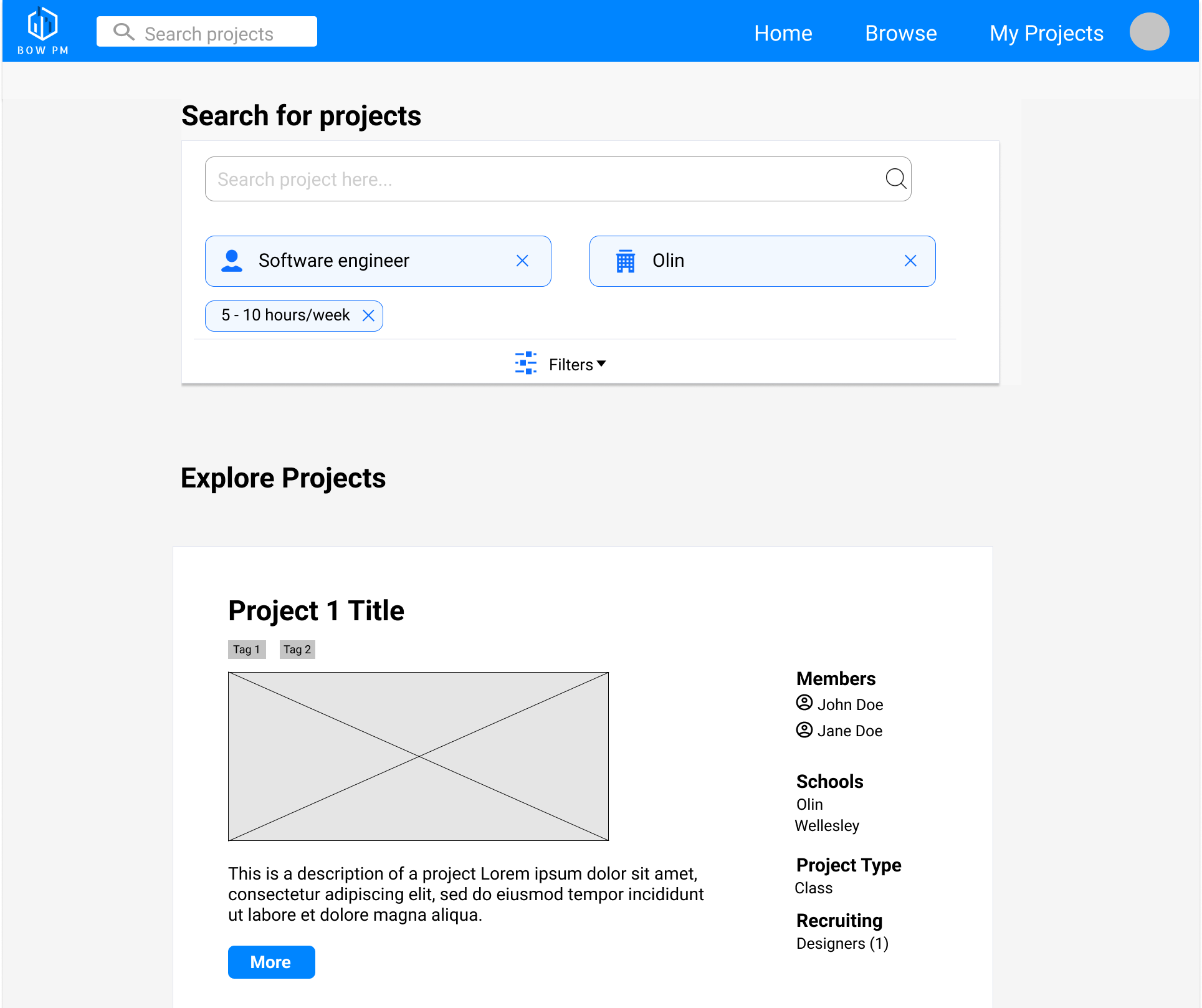
Figure 5: BOW PM Figma Designs
Home Page
Our home page (shown in Figure 6) provides a conceptual overview of the site's purpose and intended use, with emphasis on the “Find a project” button for BOW students looking to join a project and the “Post a project” button for project organizers to share their projects. The “Find a project” button redirects users to the Browse page, where users can filter projects based on interests, and the “Post a project” button redirects to either the sign in or login page if the user is not logged in or directly to the New project form, where they can enter information about their project and post it. This makes the project overview page easily discoverable, the page of interest in this case study.

Figure 6: Prototype home page
Navigation Bar
The navigation bar in in Figure 7 enables the user to navigate to the Home, Browse, or My Projects page from anywhere on the site. The user can also navigate to their profile or the Login or Signup pages by clicking the circle in the right corner (the circle will eventually be replaced with a higher-fidelity representation of a profile picture or a Login/Signup button). The BOW PM logo also takes the user back to the home page.

Figure 7: Prototype home page
The search bar affords the user the ability to search projects by project names, keywords, etc., which is signified by both the search symbol and the text prompt “Search projects.” Like the links to the Home, Browse, and My Projects page, the search bar is located in the navigation bar so it can be accessed from anywhere on the site for the convenience of the user. Many of our inspirational designs from Phase 1 included search bars in the header, such as LinkedIn, Crunchbase, and Meetup; thus, the positioning of the search bar adheres to Jakob's law.
We will now explore two case studies, where we will discuss how we came up with the chosen designs for these pages, how we chose these versions over other alternatives, and what key insights we uncovered from this process.
Case Study 1: Explore Page Search Filters
Clicking “Find a Project” from the home page leads users to the Explore page (Figure 6), where we will enter a quick case study on choosing between vertical and horizontal filter bars.
Figure 8: Explore Page with Filters
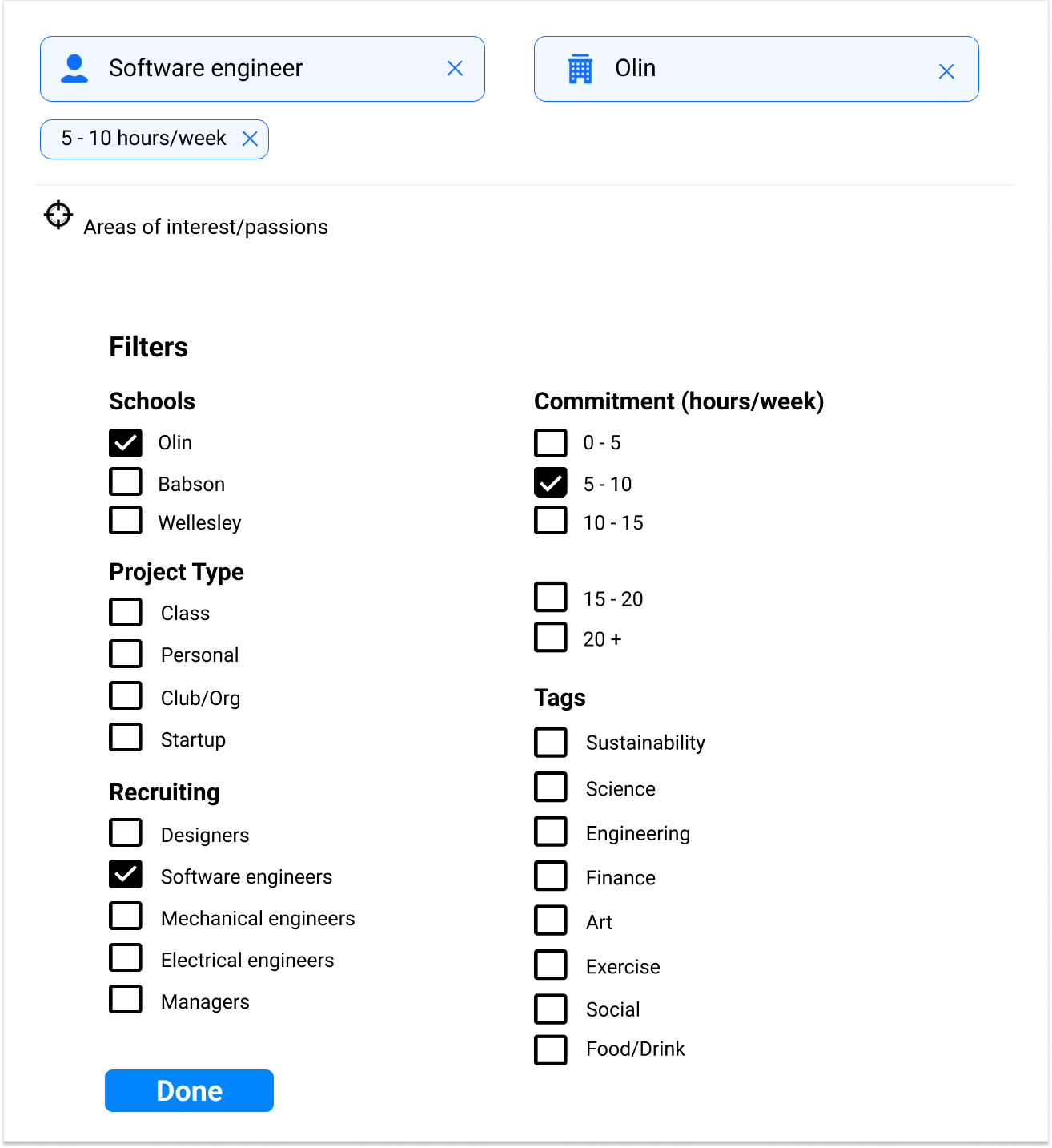
Our selected explore page (Figure 8) was actually an iteration over a previous version (Figure 9), where we chose topline filters over sideline filters after we did research on whether vertical filters on the left or horizontal filter bars were better for our product.
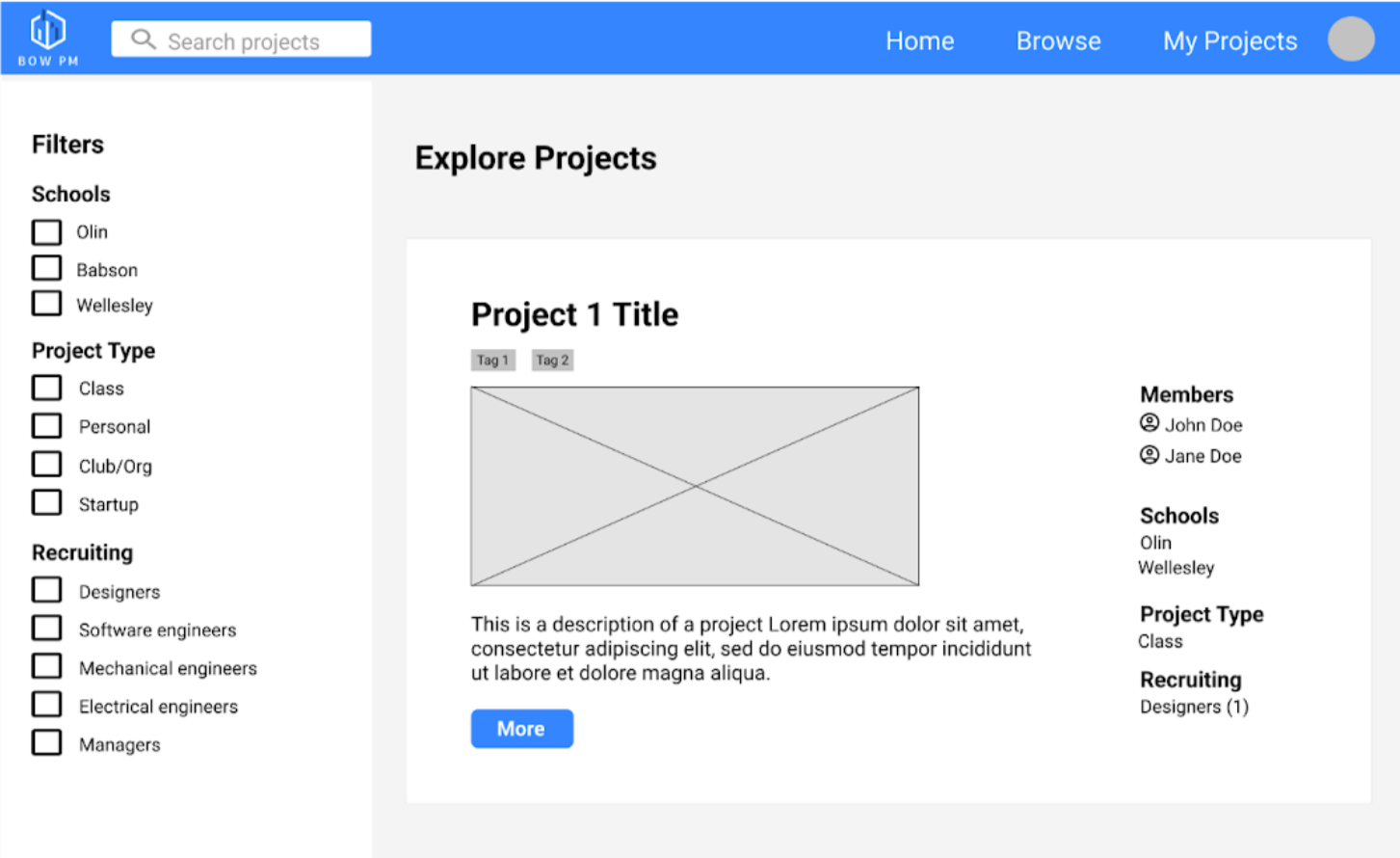
Figure 9: Old explore page with vertical filter bars
In this process, we went back to see which filter style better suited our personas. We wanted to accommodate BOW serious project seekers like Aleesha, who want deeper filters like time commitment or software-only projects, and social-seeking students like Ella, wanting to search specifically for non-Olin schools in our search bar.
Figure 10: AngelList Search Page
We then went back to our Inspirational Designs, realizing AngelList had a similar search function, where instead of searching for projects, they're searching for companies. This meant a high number of filters needed for job applicants, where many of their filters were quite similar to the ones we came up with for project-seekers. Thus, we based our search bar on AngelList’s horizontal search bar, primarily to fill the need for the many filters needed from our personas. We found that having a horizontal filter bar was ideal for our high number of complex filters.
With the AngelList layout, we made it so users can open an entire overlay of grouped filters, while still keeping the “Explore Projects” section for new users or project-seekers with no specific projects in mind to browse BOW's project selection.
Case Study: Project Overview Page Design 1
In this second case study, we will discuss how we came up with the chosen designs for the project overview page, how we chose one version over another, and what key insights we uncovered from this process.
The Project Overview page shown in Figure 11 displays a summary of a BOW project, including the project name, tags, project type, schools represented, organizers, primary organizer email, external project website, description, upcoming events, recruiting roles, and similar projects. As mentioned before, the quick “about information” listed helps the exploration workflow of BOW PM, with the listed organizer, contact, and website information enabling students to connect with the people running the project.
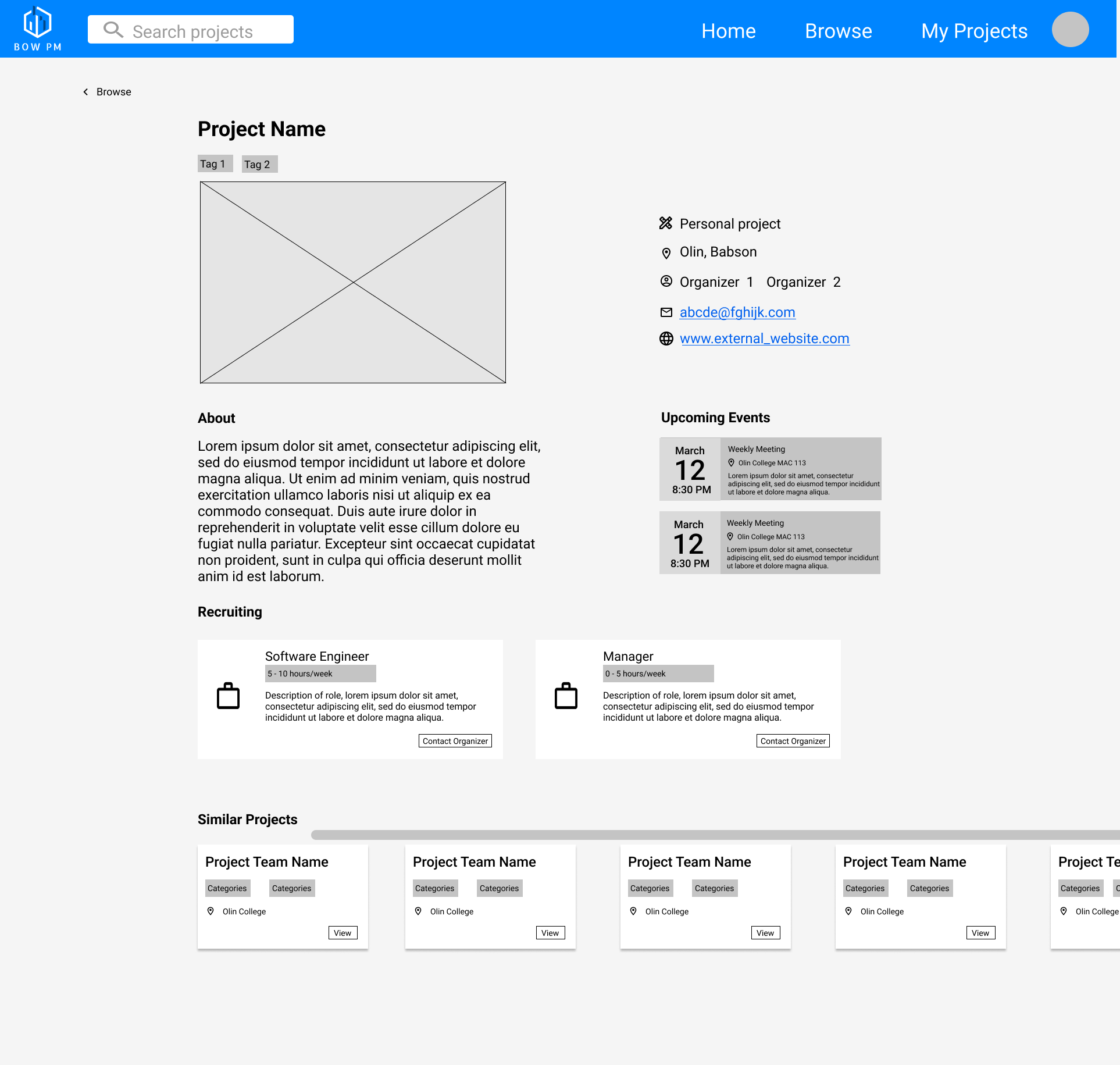
Figure 11: Project overview page
How the page works
While this page doesn't have too many affordances, some possible actions include the following: returning to the Browse page by clicking the back arrow and “Browse” button; emailing the primary organizer by clicking on the link next to the mail icon; visiting the project's external website by clicking the link next to the web icon; sending an email to the primary organizer about a position by clicking the “Contact Organizer” button underneath the role description; scrolling horizontally to see similar projects; viewing any of the recommended similar projects by clicking the “View” button; navigating to the Home, Browse, or My Projects page via the navigation bar; searching projects by project name, keyword, etc. using the search bar.
The main focus of the Project Overview page is to display more information about the project the user clicked on than the preview provided on the Browse page; thus, we have included many signifiers to help users discern what some of the listed information means, as shown in Figure 12. Next to the Project image, information such as the project type, schools represented, list of organizers, contact email, and link to the project's external website are all paired with icons, many being commonly understood as signifying their respective information type.
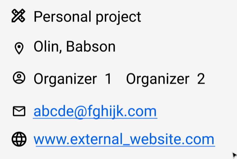
Figure 12: Signifiers
This clear and concise summary of information helps address the user's need of understanding what a certain BOW project is about while enabling the user to communicate with the project organizer and learn more about the project from the external website.
We utilized natural mapping for scrolling down to see more information about the company (on a 1920x1080 screen, you cannot view the entire frame) and to view more similar projects, as shown in Figure 13.
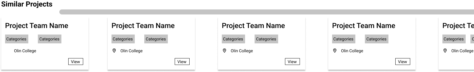
Figure 13: Logical constraints and natural mapping
In order to avoid overloading the user with information, we included logical constraints by not showing additional information like similar groups unless the user scrolls down to the Similar Projects section. This natural correspondence, where moving the scroll bar right or down shows more information in that direction, matches the user's movement. Because many sites use similar natural and intuitive mapping for scrolling, users are able to apply their intuitive expectations toward our product as well - our design adheres to Jakob's Law.
Shortcomings of this design
A shortcoming of this design is the lack of affordances compared to similar sites - for example, on AngelList, users can connect to companies through the site, save a list of companies, share a company page, and quite a bit more. In our case, we mainly settled for just providing information about the project, with the means of communication with the project team the primary organizer's email address. Even though the projects this site is for do not require nearly the amount of affordances that job listing websites do, having some of these features would be helpful. We chose to keep things simple with fewer features because including affordances like AngelList's would be extremely complicated.
Another shortcoming of this design is how many of the elements look extremely similar, with a generally uninteresting color scheme overall. We plan on improving upon both these shortcomings using feedback from usability testing.
Case Study: Project Overview Page Design 2
Another team member created the Project Overview page shown in Figure 14, which was heavily inspired by Crunchbase from the Inspirational Designs submission. Much of the same affordances, signifiers, and page structure were included from Crunchbase.
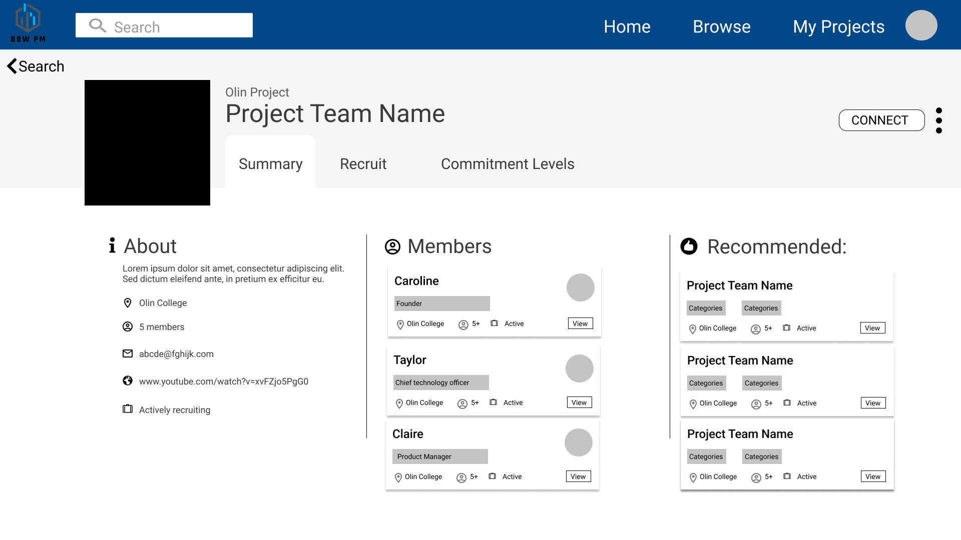
Figure 14: Alternative designs
While this version included more affordances and information as a whole, it was too complex of an interface for our goal of giving users a brief summary of a project. The Crunchbase site that this variation was inspired by (see Figure 15) is meant to display information for large, established companies, meaning much more information is available and useful to the user. This is why they included more constraints, splitting information into three tabs that can only be viewed one at a time.
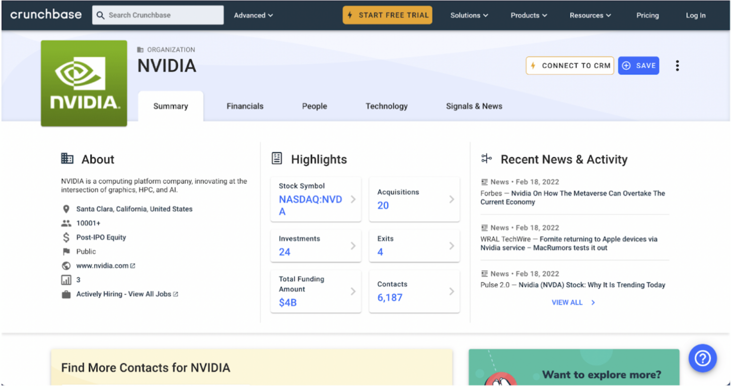
Figure 15: Crunchbase's Organization Overview page
For the student projects that we are summarizing, there is no such need for this much information, which is why tabs like “Commitment Levels” or “Recruit” were omitted from the final design, and Project Overview page 1 was chosen instead.
Key Insights
Throughout this phase, the team has taken away three fundamental key insights:
- Planned features in interaction flows are not always so obvious and need to be carefully tailored toward the target user group.
- Having more affordances does not necessarily result in a better user experience
- There are strengths from our alternative design that can be implemented into our chosen project overview page.
In the interaction flow chat, adding the “search filters” as part of the search bar was intuitive and we didn't think much of it. Realizing how the filters for search bars can be displayed in either vertical or horizontal bars, and that one version of this same feature is better for certain target markets, was extremely eye-opening. When creating interaction flows in the future, we will keep in mind that it is not enough to simply write intuitive features like a filter for a search bar, as the way we display such a feature significantly depends on who we are designing the feature for.
Another key insight was that having more affordances does not necessarily result in a better user experience or a more intuitive user interface. In the case study above, we determined that giving the project seeker the amount of information that Crunchbase gives its users about an established company was both overwhelming and impractical. Crunchbase features a lot of additional information that college projects simply wouldn't need or have. For example, Crunchbase has a page on financials, technology, and news, while also having additional dropdowns on some of the tabs which contribute to information overload.
The primary reason the Crunchbase layout is not ideal for BOW PM is that the goal of Crunchbase is different from ours: since Crunchbase is meant for all kinds of users, all kinds of information about a company needs to be provided. Our focus is narrower, and from our understanding of what our personas need, we are able to achieve a simpler layout due to our tighter focus and goals.
For low-committing users like Ella, such features are not necessary. Serious users like Aleesha also don’t need so much information as they are focusing on college student projects, and project creators like Fin will lack all the information needed for a platform like Crunchbase when they start new projects.
We also realized that requiring the project poster to generate the amount of content that Crunchbase features on their organization overview for an overview of a small-scale project might be overwhelming and discourage the user from posting the project at all.
We believe our simplified theme tailored for our user group differentiates BOW PM from other talent sourcing and project/job-searching platforms, as we focus on the important information like the level of commitment of roles for serious users like Aleesha, upcoming events & contact information for friend-seekers like Ella while focusing the platform on BOW only so project creators like Fin can work with students across the BOW and strengthen the sense of community through collaboration.
However, there were a few key strengths from the Crunchbase layout that we are considering implementing on our project overview page as we move forward to the next phase. The first strength is how the quick and most important facts about the company are to the left. With each tab to the right, the information gets more complicated and wordy/detailed. This creates a strong reading layout, as humans read from left to right, improving the user experience within the explore workflow with the ease of quickly learning about BOW projects. This aspect was implemented into our alternative design, where readers hit the quick facts first and then move on to the human element of the “Members” section.
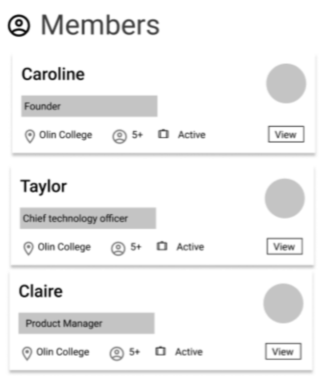
Figure 16: Alternative members section
There are definitely other components within the second design that could have been improved, such as clarifying the Recommended section and adding an events tab instead of “commitment levels.” We have also thought of replacing the members' section with a bunch of avatars icons of the project members, giving room for more information such as recruiting roles that could host commitment level information.
While it was primarily these small circumstances that made this alternative screen the loser that could have been improved, the key insights from the alternative version's aforementioned strengths are extremely valuable. We are considering implementing those strengths into our chosen project overview page, balancing reading layout, information overload, and aspects that users in our usability test like from the alternative version.
After receiving feedback on our submission for the previous phase, we identified the scope of the projects that we wanted to serve as projects that span a semester or more but do not continue after college. This means we would be serving current BOW students looking for projects or recruiting for their projects. This excludes one-time events like workshops or longer-term projects like startups by BOW alums. By narrowing our focus to medium-duration projects within the BOW community, the BOW Project Marketplace will be better able to serve current BOW students looking to collaborate on projects outside of class.
How well does it meet needs?
From our needs analysis, we learned that current barriers to BOW projects were lack of time, required energy to coordinate among schools, and differences in working styles. We also learned that students had a wide range of areas they were interested in. Considering these insights, we decided that a need our design needed to address was to minimize the required energy to learn about and join projects. We felt that we were able to address this need in many parts of our design. We intentionally do not require people who are browsing for projects to make an account, and we only make a sign in required for students who want to post about and manage a project. In addition, for the page where a student posts about their project, we went with the design that provided enough information for an interested student to know where to show up to an event or reach out to the organizer. This design does not contain as many details as the other one so that it doesn't require the student creating the post to spend more time and energy to share their project. As stated earlier as to why we chose this design, our current design also addresses needs of students who do not have the time to join a project but still are interested in learning more by providing information about projects and upcoming events.
At this point, we have not tested our design with students to how well it meets needs, but we hope to learn directly from students how this design meets needs by getting feedback for our design in the next phase.
What might change?
Aside from the aforementioned potential future changes mentioned in the Key Insights section, there are other parts of the BOW PM design that we are considering changing as well.
We might change the level of detail for project posts. Our current prototype features a save project button, which allows users to save projects that they are interested into a list that they can access later. This feature might provide users with a quick way to save projects they care about; however, it could also go unused and unnecessarily clutter the interface if the number of projects posted to the site is low enough that users are able to quickly access projects by searching or filtering on the browse page.
The Members list on the project information page is another area of our interface that we might omit. It is intended to show users browsing projects who are working on a project. This might be useful for users who are looking to work with their friends or acquaintances. On the other hand, many BOW students do not know students from outside their college by name, so it may be a feature that results in more work for people posting projects (as they may feel obligated to enter the names of every member on their team) with very limited benefit.
The calendar feature for project events might also be omitted, as we do not intend for the BOW Project Marketplace to be used to frequently update existing project, but instead to connect project seekers with recruiting projects. However, the calendar feature could be useful for advertising recruiting events that project teams are hosting, which might serve project seekers who are intimidated by messaging a project lead directly.
Next Steps
For the next phase of this project, we will be working on refining our design and developing a higher fidelity prototype. To identify the design's responsiveness to user needs, we plan to conduct usability tests; our usability test plan can be found in the Appendix. From these usability tests, we can think about tradeoffs in our design and balance them appropriately, iterating our design to better address user needs. Lastly, this next phase includes conducting and receiving evaluations such as cognitive walkthroughs and heuristic evaluations.
Appendix