Design Refinement
Testing for usability and improving our design
Phase Overview
In this phase, our team iterated upon our initial Figma prototype to improve responsiveness and professionalism. We conducted and received professional evaluations through cognitive walkthroughs, usability tests, and heuristic evaluations, and based on these results, we implemented changes into the design. The focus of this phase was updating our design to make sure that the design included all buttons and features necessary for a user to navigate between pages and to complete tasks. We also started increasing the fidelity of our prototype by refining aesthetic and design elements.
Design Evaluation
This section outlines the 3 different methods we used to evaluate our current design. All of the issues brought up are addressed in our design and can be seen in the Design Modifications section below.
Cognitive Walkthrough
The first evaluation method we used to identify areas that need to be fixed was cognitive walkthroughs. We conducted cognitive walkthroughs on 5 specific goals for our users and examined specific tasks that users would need to complete to accomplish each goal. We used Brad Dalrymple's Cognitive Walkthroughs article as a resource and used its described template.
The following list contains the 5 user goals that we explored:
- Post a project
- Apply filters when searching for projects
- Browse for projects
- Find more detailed information about a project (from the browse page)
- View a project you manage
Figure 1: Spreadsheet with each user goal we explored, relevant tasks to achieve each goal, success of task, and notes.
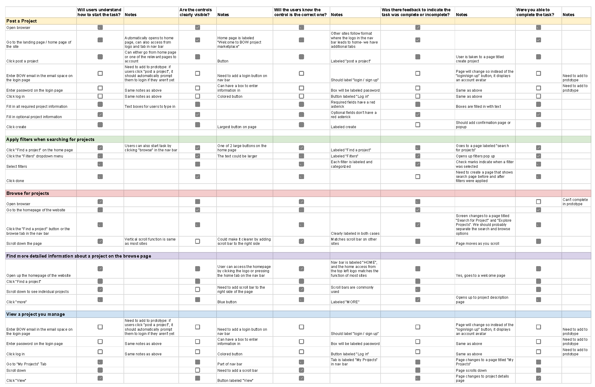
Specific tasks for each goal can be seen in the above table, Figure 1. For each task, we also documented the success of the task by asking 5 questions for each task and writing notes about it:
As we went through each cognitive walkthrgouh for each user goal, we found several issues that we needed to fix:
Heuristic Evaluations
To further evaluate our current design, we received feedback from our classmates through heuristic evaluations. Our classmates evaluated our current design and examined its compliance to Jakob Nielsen's 10 general usability principles. The full reports can be seen on the Heuristic Evaluation Reports and are also linked in the Appendix at the bottom of this report.
We received lots of valuable feedback from our classmates, and the following are the main areas of heuristic issues that they found in our design:
Usability Testing
The last way that we received feedback for our current design was by conducting 2 usability tests. More details about the usability test are included in the Usability Study Plan and the Usability Test Report.
The main findings from the Usability Tests are listed below:
- When creating a project and listing open roles, the term Role is unclear to users. Users were not sure if this meant the project creator's role or what qualifications were required to be in the project.
- The project description when creating a project is too open ended in that it does not require specific details. This leads to vague and short descriptions.
- The project image is not specific enough and users were unsure if they should upload a team photo, a general photo that aligns with the project, or an image of the project.
The following are recommended edits to incorporate in our design to address the above findings:
Design Modifications
Based on feedback from our classmate's heuristic evaluations, our usability tests, cognitive walkthrough, and Marco's suggestions, our team was able to implement significant design modifications to strengthen our design. In this section, we will walk through our current design and point out specific edits we made in response to our findings in the design evaluations.
Home Page
Our iterated design starts on the home page. The home page contains a brief description about the platform and has examples of projects that other people in the BOW community are working on. From the home page, users are encouraged to either find a project or to post about a project. While these choices are emphasized by the use of large buttons, they are not the only choices users have. Users can also use the navigation bar which is accessible on all pages. The navigation bar contains a home tab, a browse projects tab, a login button, and sign up button.
Figure 2: Previous design of our home page
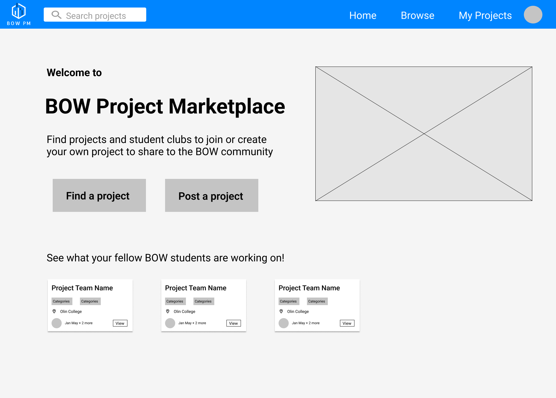
Figure 3: New design of our home page
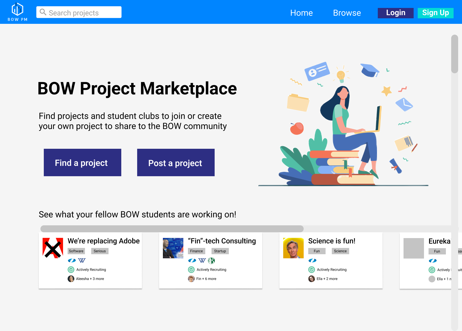
From the home page, we can see that one of the issues found within the Cognitive Walkthroughs and heuristic evaluations, the lack of a login or signup button, has now been implemented within the navigation bar. Our previous prototype only had a single design for the navigation bar that indicated that the user was logged in through the profile image placeholder and the “My Projects” tab in the navigation bar, but we had not included a way for users to login. Now, the default navigation bar when users first open the prototype does not have the My Projects tab or the profile image, and instead have login and sign up buttons. If the user wants to post a project, they are prompted to login to their account, and once the user logs in, the login and sign up buttons on the navigation bar disappear and instead show the user's profile image.
Figure 4: Previous design of our navigation bar

Figure 5: New design of our navigation bar before the user has logged in

Figure 6: New design of our navigation bar after the user has logged in

Before this phase, our group had discussed whether we should require all users to create an account in order to use this website. However, we decided to only require an account for users that want to post a project and to not require users to create an account to browse for projects. The main reasoning behind this was to address the need we learned about in an earlier phase that students need a low-activation energy way to connect with projects that students are working on from other schools. The issue about logging in being brought up in the usability tests and heuristic evaluations solidified our decision to only require people who want to share projects to login; as such, we made our design so that it would not require a login for users that are only browsing for projects.
Another change added was the “tone” of the page. When conversing with NSyncamore (another team in our class), they told us how our website made them feel like they were applying to a job, and it didn't have the “college student project” vibe that we were going for. Thus, when increasing the fidelity of our design to get a better visual of the final home page design, we decided to include more engaging and less professional elements to compel users to explore functionality of our site. This included adding fun jokes within the project titles of example projects at the bottom of the home page, and including a visual of a college student on top of books to help users make sure that our project is for college students. In our redesign, we better utilized site colors to draw the user's attention to buttons and interactive features and optimized elements to better showcase site functionality available immediately to the user (which was another issue pointed out within the Heuristic Evals). Specifically, we added color to important buttons such as the login or signup buttons and the find or post a project buttons.
Within each project card, we implemented a suggestion from Marco on how real examples of cards don't have a primary call to action (like our view button) and instead have the whole card being clickable. Thus, in an effort to follow Jakob's law, we also got rid of the view button and made each project card clickable.
Create Project Page
Once a user has logged in, they are taken to the “Create Project” page, which is another page we modified based on usability issues we identified. We fixed the Create Project page and implemented many of the changes suggested by other groups in their heuristic evaluations of our prototype. We also implemented changes to address issues identified during usability testing.
Figure 7: Previous design of the Create Project page
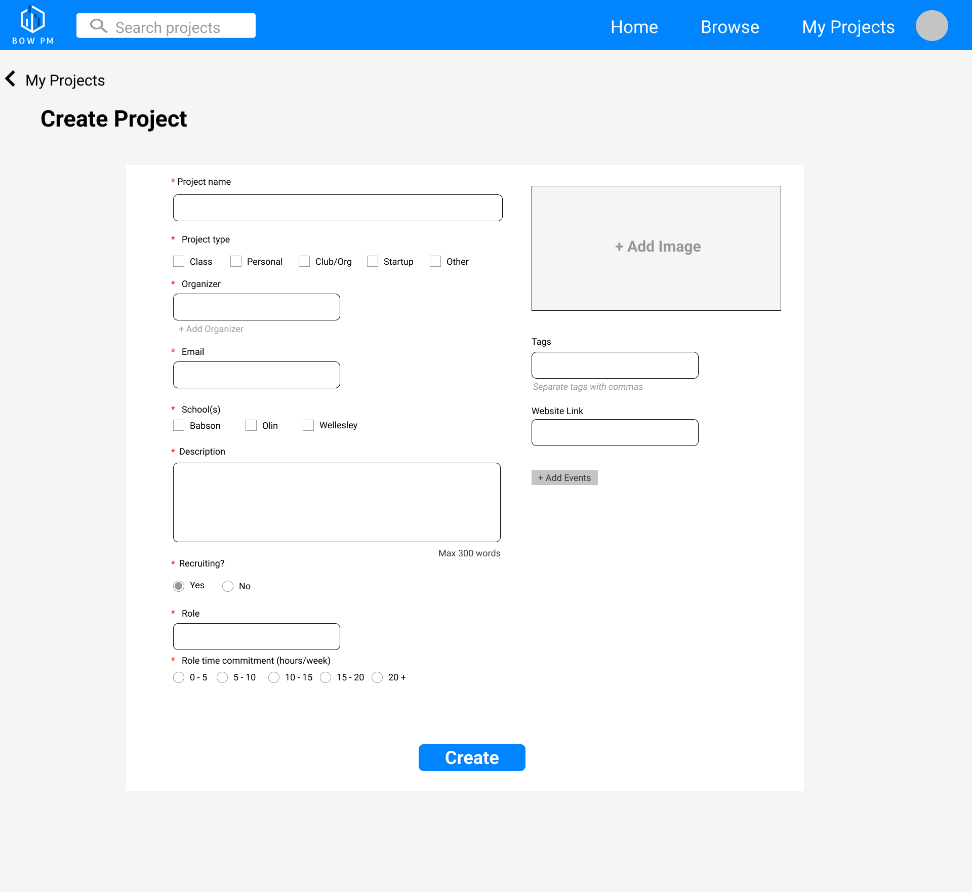
Figure 8: New design of the Create Project page
.png)
To increase the lack of user freedom and control that was identified as a heuristic issue, we added the cancel button to allow users to cancel creating a project. When users click cancel, we added a warning popup message that reminds users that their edits will not be saved and confirms that they wanted to leave the Create Project page. This further increases the freedom and control of users and helps prevent errors, which are 2 heuristic issues. We also addressed the issues and recommendations that were brought up in the usability tests by including a word minimum constraint, adding extra information about the recruiting section and clarifying what Role means, and adding suggestions for what image to include. If users are confused about what role they should put, they can click the info bubble next to the recruiting field which shows a popup describing what the recruiting field is in further detail. Incorporating a minimum word constraint will lead to less vague and short descriptions, and ensuring project creators list specific details about their project, which will be useful to project seekers.
Edit Project Page
In an effort to make our product more robust, we added editing functionality for existing project posts by creating an Edit Project Page. From this page, users are able to delete an entire project or edit components of it, including affordances like adding/removing roles, replacing an image, and editing all fields of text. Similar to the Create Project page, users will get a warning message if they delete the project or leave the page by clicking cancel.
Figure 9: The Edit Project page
.png)
Browse Page
Figure 10: Previous design of the browse page
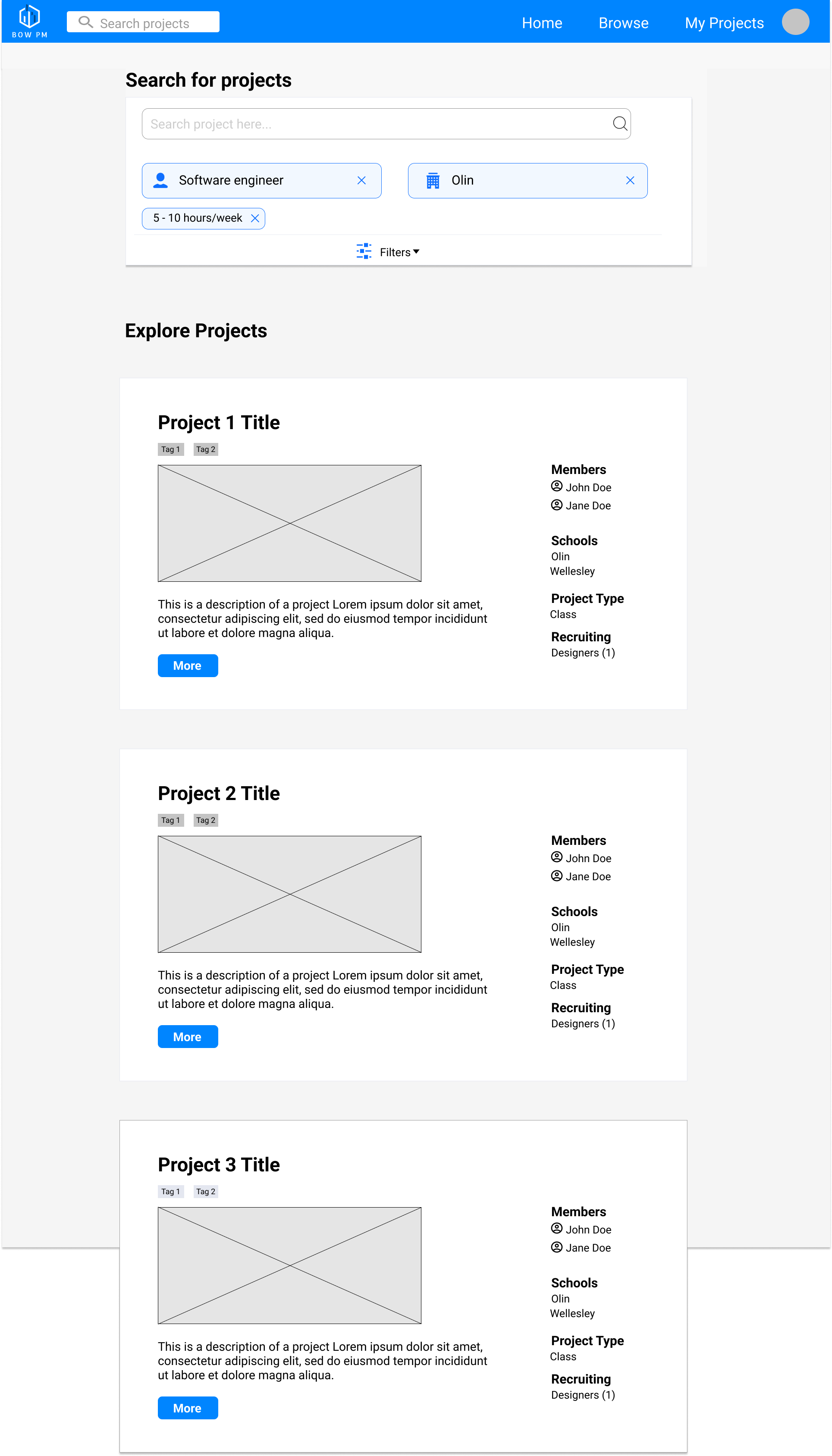
Figure 11: New design of the browse page
.png)
Users that want to browse for projects can access the Browse page from either the navigation bar on any page or the “Find a Project” button on the home page- both lead to the same page. As mentioned above, users do not need to create an account to browse projects.
The primary changes to this page was within the “Explore Projects” section, stemming from feedback from Marco. His suggestion included redesigning the cards in a way that fits more projects/results in a given page, instead of having a singular project card stretching the entire screen width. This design makes sense when thinking about the users we are designing for. Some users, such as Aleesha the Wellesley student and Ella the Olin student, will benefit from being able to see a higher number of projects on a single page. They do not have a specific project that they want to join, so being able to see information about more projects in a single glance is more useful than seeing fewer projects.
When redesigning the cards, we reconsidered what information would be most important when browsing through projects quickly. Since people read from left to right and up to down, we wondered what the best way was to organize our information, and whether any should be deleted. To get inspiration to answer this question, we looked at AngelList.
Figure 12: AngelList formatting inspiration
We decided instead of having a full stretched visual (seen in the previous design in Figure 10), that we would instead keep the visuals to being a logo next to the title as AngelList did. We also realized that a short description was all that would be necessary in the browse page instead of a long paragraph which would contribute to information overload; having brief text below the title would give project seekers enough information to know a bit of what the project is about, and if it aligns with their interest, they can click on that project to see an even longer description.
Part of the inspiration for the redesigned cards came from our conversation with NSyncamore about each other's designs. They brought up that the logos of Babson, Olin, and Wellesley are well known in the BOW community and that within each project card in the browse page, we could use icons to represent the schools instead of listing the school names for each project which was increasing clutter. Thus, we replaced the college names with their logos.
For information like schools and organizer names, we decided to remove their labels (such as “Schools:” as having more text only worsened information overload, when simply using icons as our “labels” conveyed the same information.
We decided to emphasize the recruiting roles of each project since that would be the main goal of project seekers, who are looking for roles to fill in projects. In the old version, we listed the number of positions with a number in parentheses (like Designer(1)), however, this was slightly unclear, so we changed it to “1 position available” to avoid any confusion.
Similar to the home page, we found that having a “view” button was entirely unnecessary, with many other websites simply making cards like ours clickable. Thus, in an effort to follow Jakob's law, we also got rid of the view button and made each project card clickable.
Filters Menu on Browse Page
The filters menu on the Browse page originally included an option to filter projects by role commitment level. However, after speaking with Marco, we realized this feature might be more confusing and restrictive than helpful. Since we anticipate hosting a few hundred projects maximum, we realized that filtering projects by roles being recruited and commitment level would likely yield few or no search results. For this reason, we removed the commitment filters completely. We believe that the remaining filters (schools, project type, recruiting, and tags) will enable the user to browse projects according to their interests with ease while minimizing the possibility that zero results are returned.
We also addressed some heuristic issues on the filter page. A piece of feedback we received was that the icon used for the school name in the filters was inconsistent with the icon used on the project description page, which we resolved by changing the icons used in the filter. We also included an X in the top right corner to allow users to exit the filters popup and to increase user control and freedom, another major heuristic issue found. X's were included in the login and signup page as well.
Figure 13: Previous design of the filters menu
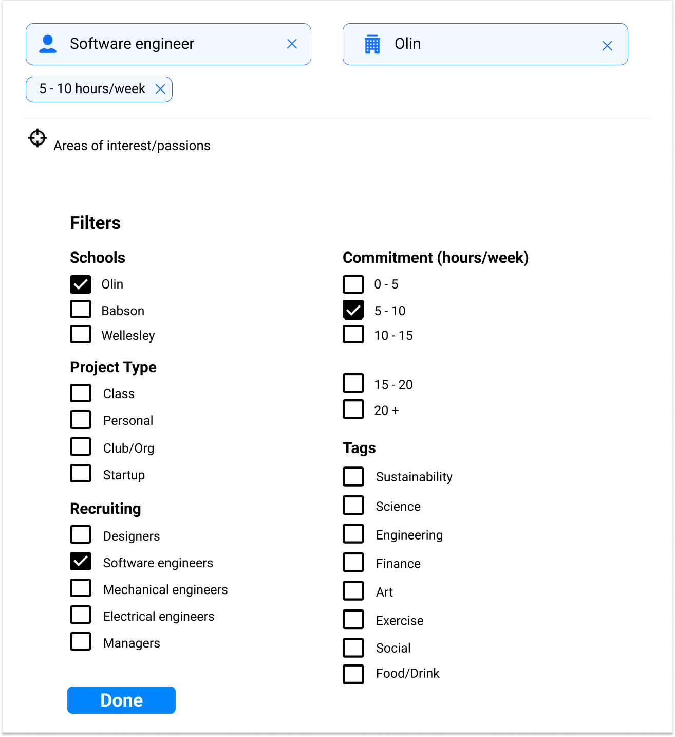
Figure 14: New design of the filters menu
.png)
Project Description Page
Once users click the view button on a project, they are taken to the project description page. One modification is that we added an arrow leading to the previous page that the user was on whether it was the “Browse” page or the “My Projects” page. This increases user control and freedom by letting them easily go back to the previous page they were on. If a user was on the Browse page previously, they will be able to go back to the same filters or search results instead of having to click the “Browse” button which would refresh the filters. Another modification is that we omitted the “Upcoming Events” section of the project description. We received feedback in the heuristic evaluations that the information presented in this section was too cluttered and not easy to read. Unfortunately, due to time constraints in this phase, we were unable to resolve this issue and instead decided to omit the entire section, but we hope to bring it back in the next iteration.
Figure 15: Previous design of the project description page
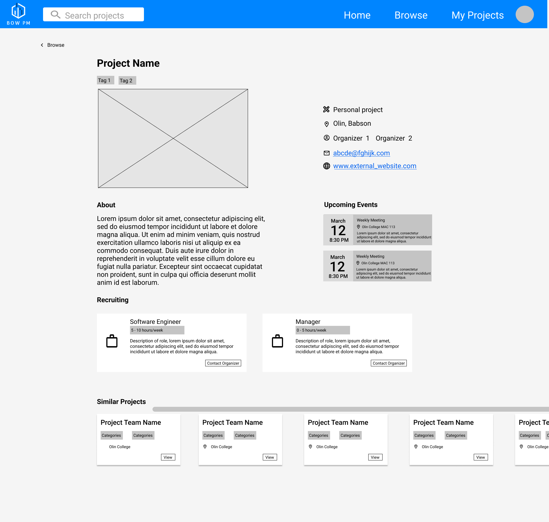
Figure 16: New design of the project description page
.png)
General Design Modificatoin
Some general design modifications we made that are not specific to a single page include increasing the consistency within the design and using clearer controls that signify a function. We received several comments in the heuristic evaluations that our design had consistency issues across pages in terms of layout, font, icon size, etc. Thus, we created a “UI Library” page within our figma file, which included all the font sizes and boldness levels that would be used and made sure all icons and their variations have the same size by matching every icon in our designs next to each other, and also standardizing our navigation bar using components.
A couple of these issues were due to our team misunderstanding the scroll function and were resolved as soon as we standardized the page size to make it consistent. In addition, we included a visual of a scroll bar on all of our pages to address feedback that it was unclear that you could scroll on a page. While the scroll bar itself does not have any functionality in our prototype, it lets users know that the page has scroll functionality.
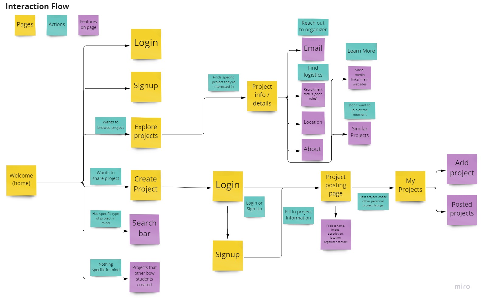
Updated interaction flow
After editing the design of our prototype, we also updated the interaction flow to reflect these changes. The main changes are including access to login and sign up pages on the welcome screen, prompting users to login when creating a project, and simplifying the design by omitting some features such as saved projects and upcoming events.
Figure 17: Updated interaction flow diagram
Shortcomings and Omissions
Bow Project Marketplace Design
There are a few design features that we did not include in this phase but are hoping to include in the next phase. We included a search bar in the navigation bar to allow users to search for projects by keyword, but in our current design, the search bar is just a visual element and has no functionality. In addition, we received some feedback that when users are on the “Search for projects” page, having the search bar in the nav bar and the page is redundant and confusing. Keeping the search function from the nav bar will allow users to search for projects from any page they are on, but we would need to figure out how to address the extra search bar when users are on the “Search for projects page”.
Another feature we are hoping to include in the next phase is for users to be able to save projects. Users can bookmark projects that they like and access all of their saved projects from a single page. We unfortunately had to omit this feature during this phase because we wanted to dedicate some time to conduct heuristic evaluations and did not have enough time to get to it.
A feature that was omitted from this prototype is the information about relevant upcoming events on the project description page. We originally had it included in our initial prototype, but we decided to omit it because we received feedback that the formatting of the upcoming events section is too cluttered and has an heuristic issue with minimal design. We hope to fix the format to make it less cluttered and include it in our next iteration of the design, but unfortunately, we were not able to get to it in this phase. The “Upcoming Events” section is important for users like our persona Ella the Olin Student because it provides low-commitment opportunities for them to connect to and learn more about a project without joining the team. This section also makes it easier for users in general to show up to a meeting by providing all the necessary information on the project description page. This eliminates the extra work of reaching out to an organizer or finding the meeting times on the project website.
Another feature we plan to implement in the next phase is success messages that are overlaid on the screen after a project is successfully created, deleted, or edited and saved. This gives users confirmation that the action they are performing was successfully completed and will help to avoid confusion.
Usability Test
We also identified omissions and shortcomings in the Usability Test Plan and the 2 Usability Tests that were conducted.
- Sampling bias: Undercoverage sampling bias occurred with the usability test since only two students that were friends of Julian were interviewed: one Babson student and one Olin College of Engineering student. This means the majority population of BOW students who did not know Julian weren't interviewed, meaning B-Tree-S missed lots of feedback. Instead, B-Tree-S should've conducted a systematic sample to get random participants from each BOW school.
- The usability test plan didn't cover the finalized BOW Project Marketplace prototype. While conducting the usability test, the users pointed out unfinished elements of the prototype which the B-Tree-S team already knew needed to be fixed. For example, under Search for Projects, a user pointed out that he couldn't deselect a preselected filter when searching for a project. Another user pointed out in the same frame when he scrolled down and the header of the page went down too which obstructed the view of the page.
- Giving hints too early. When conducting the usability tests on the two users, Julian gave hints and confirmation too early to the users. For example, when asking the Babson user what he would put under Project Name for a model rocket project, he said he would put “creating a rocket that goes to space,” and asked Julian if that was what the form label wanted. Julian then immediately gave a hint rather than asking him a probing question such as “what makes you confused about that form label”?
Key Insights
We gleaned several insights from the usability testing that informed our design decisions. One insight was that we needed some minimally invasive way of explaining certain terminology we were using. In order to present the user with additional information at their demand, we decided to include a clickable info icon that displayed a message explaining what words and phrases mean.
Another insight we had was that instead of completely freeing the user to use the site in ways that might be unproductive, we should ensure that features guide users to use the site in the most productive way possible with controls. Zoë realized this after a conversation with Marco about the filters section of the Browse page; Marco suggested that allowing users to filter by role time commitment might lead users to apply time commitment filters in addition to school, tags, and role filters and lead to very few or no results being returned, as we do not anticipate hosting more than a few hundred project posts on our site. We realized that while users may desire certain functionality, enabling them to use the site to their own detriment is something that we should control for.
Another insight was the importance of color. We learned how the colors we had chosen (and the lack thereof) led classmates doing our heuristic evaluations to think they were applying to a job, rather than joining a college project. This forced us to compensate by incorporating other elements to make it more college-fit, however, knowing the importance of choosing the right color palette will be extremely important going forward with future designs.
We also learned more about icons from heuristic feedback, and how they can be used to convey the same information with less text and information overload. This was applied greatly in redesigning project cards, and was much clearer than when everything was in text form. It also gave us a great chance to apply a concept we had learned from the last phase, where our alternate design for the project description page placed fast and important information on the left and less important on the right, which is the same way humans read from left to right. Building the project cards was great practice in applying that insight.
Team Effort
This phase consisted of 2 main areas of work: evaluating the designs of our classmates, updating the Figma design, and evaluating our own design. The entire team worked on conducting heuristic evaluations for the 2 other teams in our class. We each wrote an individual report and worked as a group to create a combined team report. Zoë and James primarily worked on editing the Figma design, and Claire also did a bit of work on the design. Zoë focused on making changes to the Figma prototype that were suggested in the heuristic evaluations and usability testing. James created a higher fidelity version of the home page, redesigned cards for the browse page, and made the UI library to make all icons consistent and anything that was repeated into components. Claire worked on embedding the login functionality by creating specific pages, editing the navigation bar, and creating variations of pages. Julian and Claire worked on evaluating our own design. Julian took on creating a usability test plan and conducting 2 usability tests to receive feedback. Claire conducted the 5 cognitive walkthroughs.
Appendix