Design Refinement
Identifying and Addressing Usability Issues
Prototype from Last Phase
Feedback and Weaknesses
We did a heuristic evaluation activity in which we reviewed another team and had another team review us. Here is a link to the feedback we received from the other team.
We then used that feedback to focus on some of our design’s weaknesses.
Addressing Weaknesses
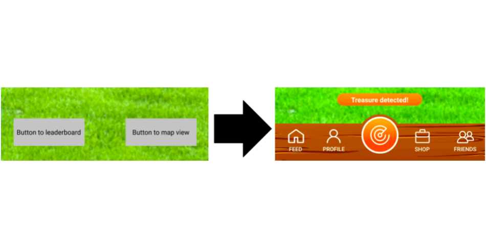
Improve navigation between screens
Previously, our navigation between screens consisted of each screen having 1 or 2 buttons at the bottom of it, which was a confusing and circular navigation format, which made it difficult for users to figure out how to navigate to certain screens.
We decided to change our navigation from buttons at the bottom that change depending on what screen you are on, to a consistent navigation bar. We think the navigation bar will be far better for users because they will be able to determine what page they are on all the time.
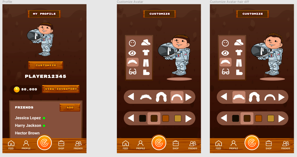
Clarify the role of the user’s avatar
We had the option to buy accessories for the user’s avatar in the store section, however, it was not clear in any of the other screens how the avatar would be used. We created a page for the profile to better explain this as well as avatar customization pages and showed the user’s avatar, as well as their friends’, on their map.
We fixed this problem by making a screen where users could view their avatar on their profile, and also making a screen to edit the avatar. We also used the same avatar between the profile page, and the map, which should make it clearer on the prototype that the avatar is the same as the avatar that appears on the map screen.
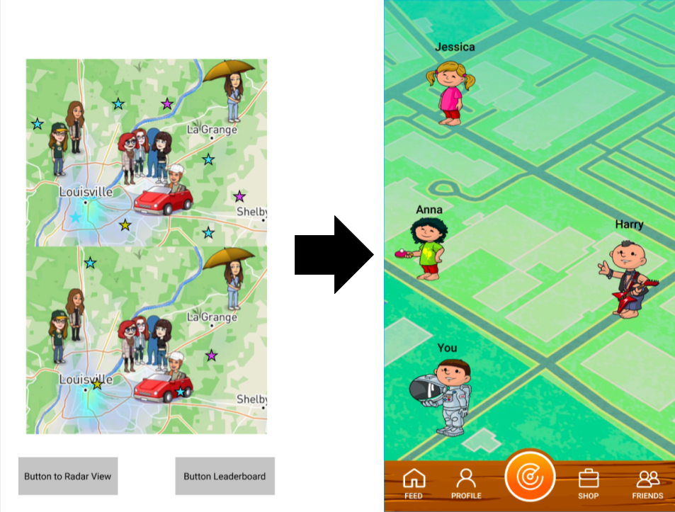
Make the map screen less confusing
It was confusing to have 2 maps on the same screen because that implies there might be a difference between them.
We solved this problem by making a full screen map and using more unique avatars that were not just from a screenshot of Snapchat.
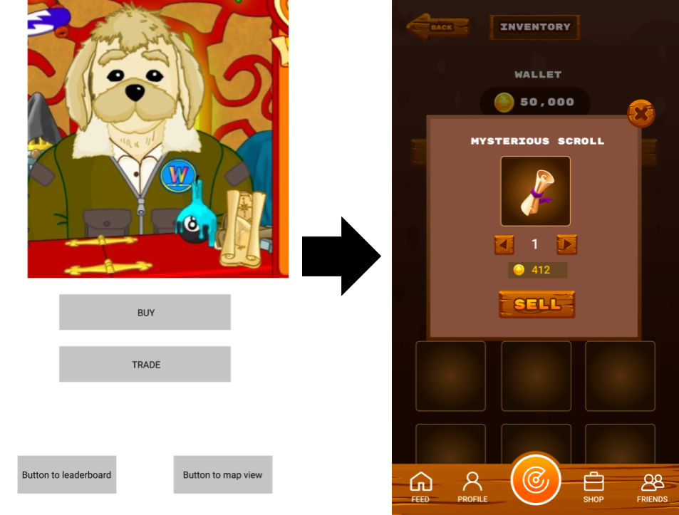
Clarify Sell/Buy Mechanism
The mechanism of selling in the store is confusing, because users can only sell something after clicking buy.
We moved selling from the store section to the inventory section so users can more easily sell items.
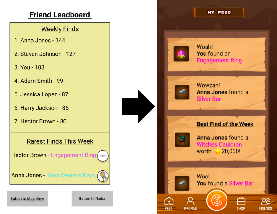
Leaderboard visibility and colors
Our evaluators said that some of the text on the leaderboard was difficult to read due to the color, so we changed the color.
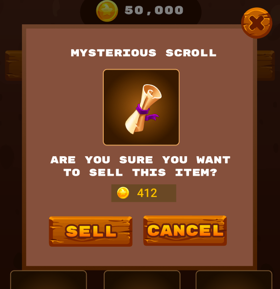
Reducing user error in the store
We got feedback that it would be difficult for users to recover from errors if they accidentally sold something in the store.
So we made a screen where users can confirm if they actually want to sell an item before committing, in order to reduce mistakes.
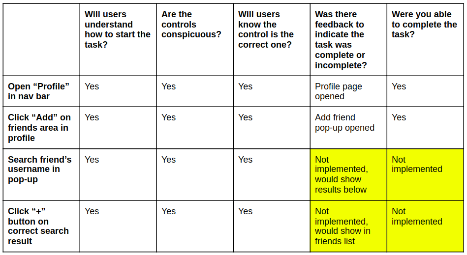
Cognitive Walkthrough
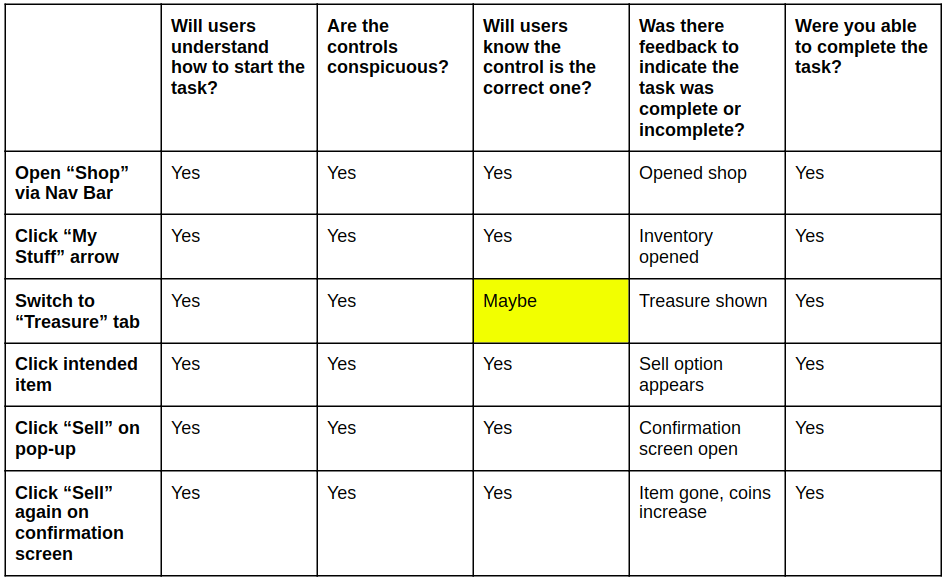
User Goal 1: Sell an item
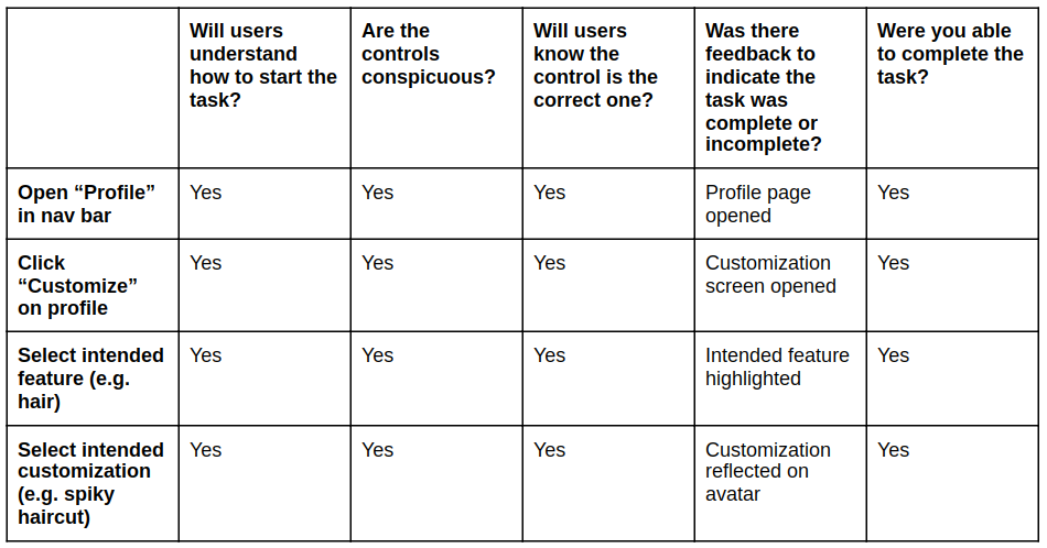
User Goal 2: Customize Avatar
User Goal 3: Add a Friend
Shortcomings
Although we made significant progress during this phase, there are still many things to improve
- We could add more explanation or interaction on the digging page to give a better sense of how the game works.
- We still have not implemented a way for people to equip items that they find or purchase (e.g. outfit, eyes, accessories, etc.)
- There is no way for users to equip or customize their avatar directly from the inventory page
- We don’t have much in the way of a home page, the game just starts
- We could make it more clear what the map means and how it displays friends and locations
New and Improved Prototype
Effort Map
| Team Member | Tasks |
|---|---|
| Katie |
|
| Theo |
|
| Erika |
|
| Maalvika |
|